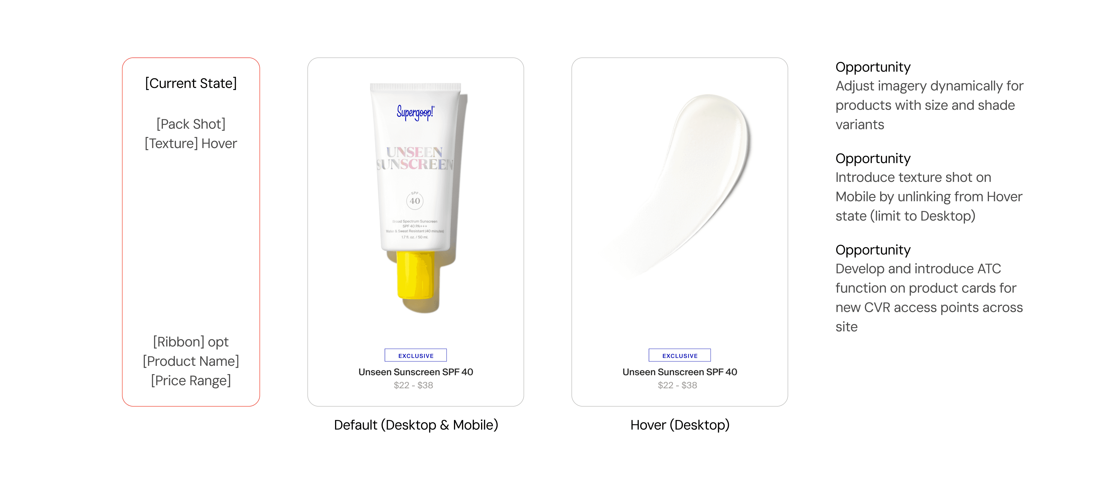
Details
Responsibilities
Competitive Analysis
Stakeholder Strategizing
User Research
Lo-to-Hi Fidelity Prototyping
Stakeholders
Digital Design Director
SVP of Direct-to-Consumer
External Development Team
QA Engineers
Overview
Context
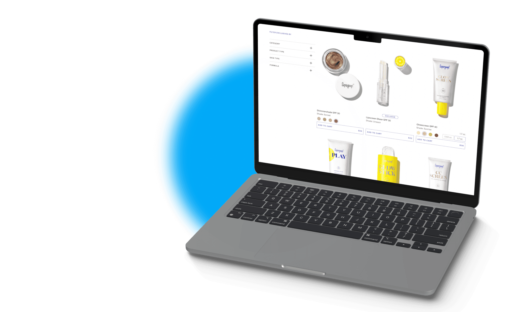
original product card
Competitive Research
I began research by exploring Product Cards and Add-to-Cart (ATC) features across various E-commerce websites. In my research, there were two widely used approaches with ATC: Pop-Out Modals vs. Responsive In-Laid Components. Pop-Out Modals were more commonly adopted for product catalogues that featured many products with 2+ variants, and so I opted to adopt the Responsive In-Laid Component approach.
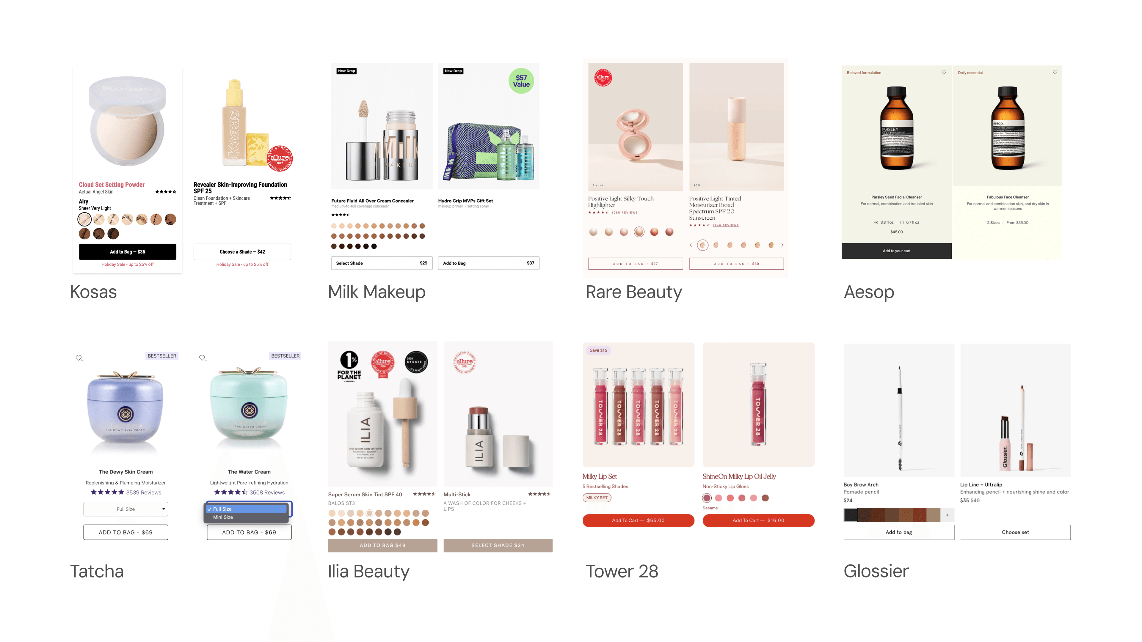
I began outlining the core product catalogue and how Supergoop's merchandise varies to determine what kind of selectors we would need. No Variant and Single Variant SKUs made up the majority of the product catalogue, but there was one outlier that required a Double Variant Selector (Glowscreen SPF 40).
This SKU introduced the greatest challenge. Across competitive research, I had difficulty finding elegant solutions to double variants being surfaced within a Product Card's ATC Component. Often in these cases, brands will separately merchandise shade variants by size. Though cumbersome for users, this approach makes sense as most of these brands also relied on Shopify to merchandise their products, and Shopify works best when organizing products up in this manner.
In an effort to reduce the effort required by users, I decided to explore solutions that would host double variant products within a single product card. While this would increase the work on the internal side for product management and execution, this approach would increase users convenience when searching for variant products online.
key stakeholder priorities
Reduce number of new components in ATC feature design
Align closely with how products are merchandised in Shopify
Explore novel ways to surface the double variant product type without relying on modals
ux priorities
Align with development resource requirement
Test to include edge case of double-variant SKU
Ensure new components keep with accessibility standards
Wireframes
With development team confirmation, I began the prototyping phase and produced a first set of wireframes for the Product Cards. In this approach, the goals were 1) to reduce the new components being added to the design system and 2) preserve the integrity of the PLP as variants were selected. The initial approach, illustrated below, consisted of hosting all variants in dropdown menus.
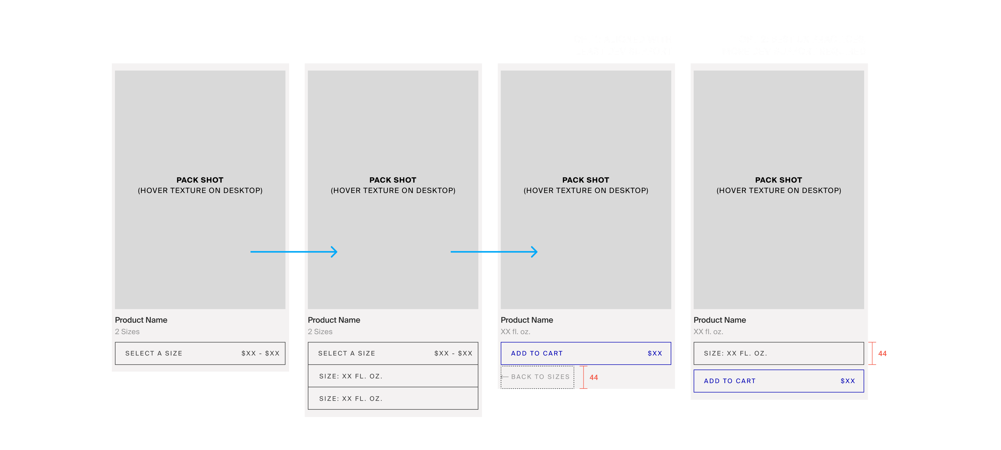
issues
While this solution aligned closest with how the products were merchandised in Shopify (making it an easier push to production), this design hindered key flexibility for users when alternating between variant selections. This was a strong enough of a barrier for our team to work with the DTC team and reprioritize the user's experience as the most important focus of the redesign.
Another prominent issue in this design approach was the overcrowding of the dropdown menu. While listing out each SKU made the most sense with how products were set-up in Shopify's back-end, this became a confusing experience for users as they'd have to search through the list to find the specific combination of variants. This was particularly noticeable in the Double Variant SKU Wireframes.
User Testing
To test the emerging concerns around this approach, I conducted a series of internal user interviews. During the interviews, I asked users to walk-through the Add-To-Cart journeys of 1) a Competitor's Website, 2) a Fashion Brand's Website, and 3) a Prototype of Supergoop's Website staged with the new wireframes functionality.
Overview
Flows
1. Use a Beauty brand's DTC website to purchase a lip product you've used before
2. Use [Brand's] website to purchase a pair of jeans
3. Use this internal mockup to purchase [Product w/ variants]
Observations
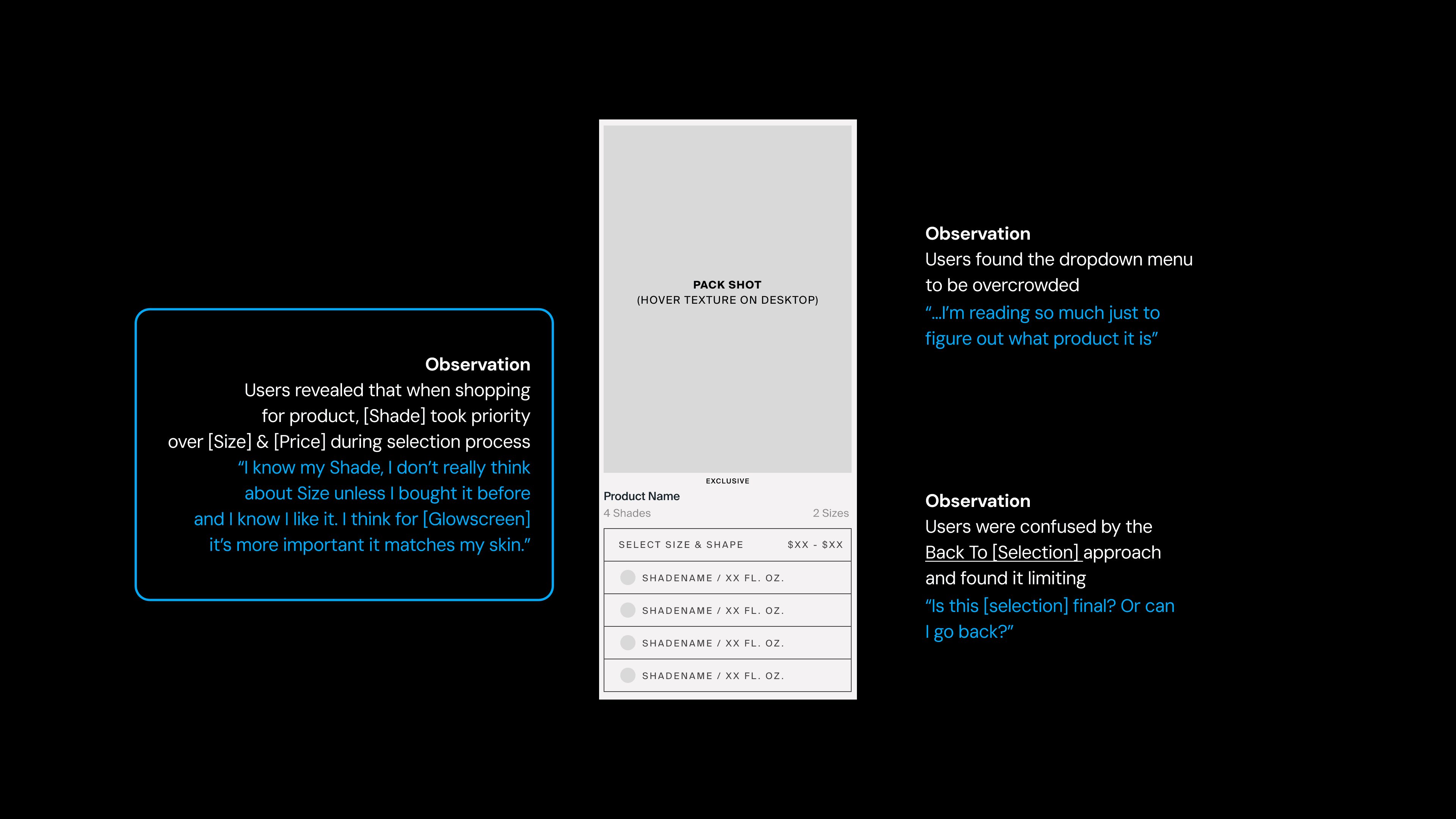
Users prioritized a Single Variant within Double Variant products. Rather than thinking of each variation with equal weight to each variant, users would envision and approach the shopping experience as if the product were of a Single Variant.
Findings
Users wanted more flexibility to make variant selection changes. The Dropdown Menu approach, instead, introduced an additional and extraneous step to this.
Users interacted with products with all # of variants as Single Variant products. One Variant was most prominent in their Add-To-Cart journey, and in the Double Variant case Shade Variant > Size Variant.
new directions
Move away from Dropdown Menu as this design stacks the variant selection area with the Add-to-Cart CTA, forcing an extra step in changing variants.
Create an In-Line design approach where all selectors are exposed, taking into consideration the one Double Variant product that introduces real-estate hurdles
I brought the findings from the user research to the DTC team, and we reached alignment on reprioritizing the focus for this project towards usability (previously dev resource preservation). This provided an additional ~2 months of production time.
Based on the lean UX findings, I revisited the design to create components for each variant type (size & shade). I began a second mid-fidelity iteration with selectors were surfaced at all times when exposed to users. This approach would address the issues of error flexibility and mental model mis-alignment.
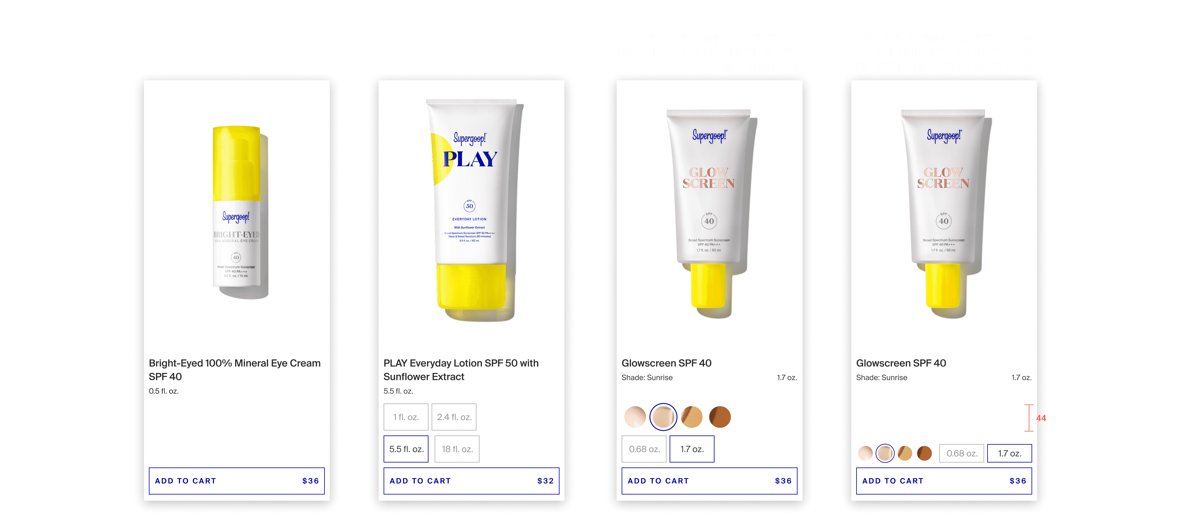
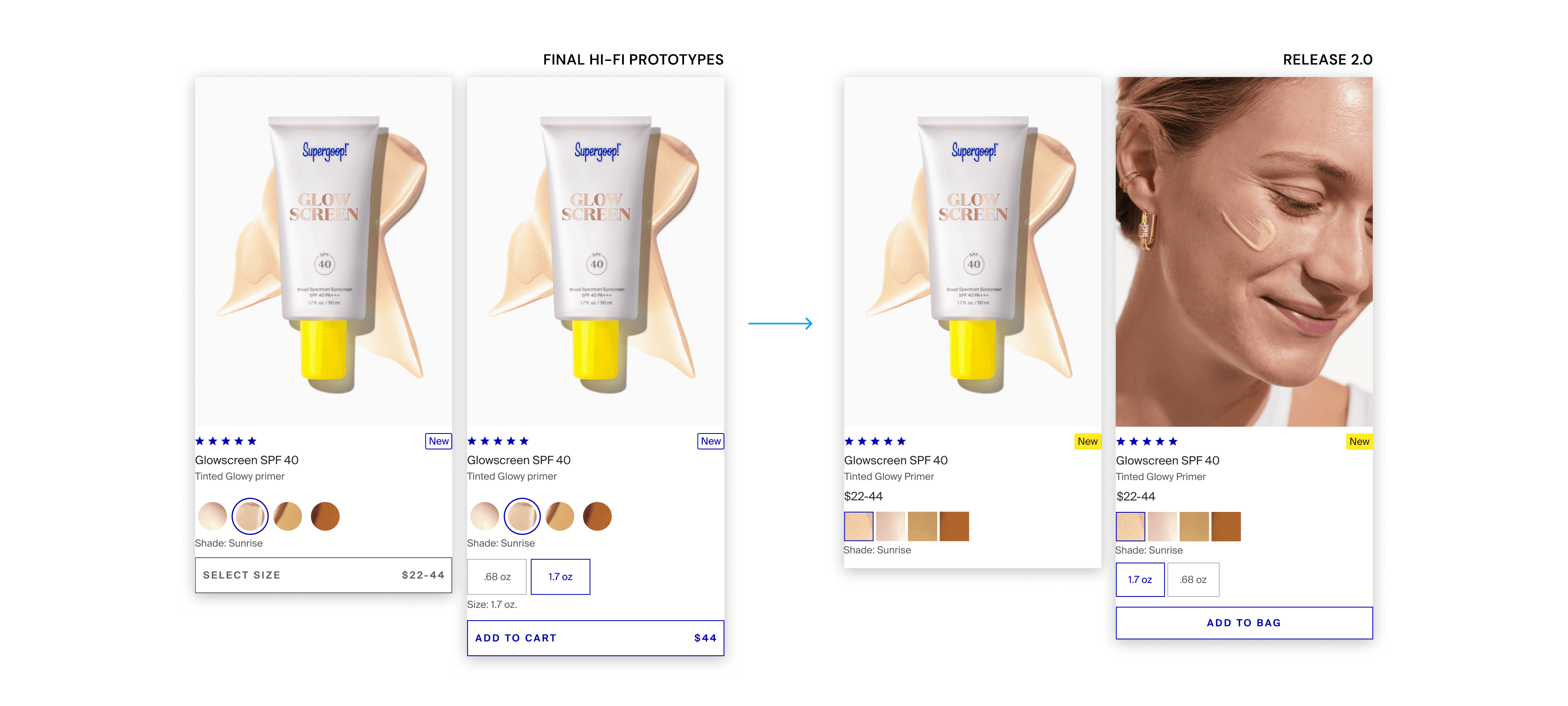
DTC, Creative, and UX reviewed the prototype, and problems arose around the edge case of Glowscreen and its screen real estate. This SKU was a cornerstone product in the catalogue and would be featured across multiple PLPs. This led to the cross-functional decision to go with Opt2. The cross-functional hypothesis was that the streamlined appearance of the exposed ATC feature on PLPs would be worth compromising some of the usability of this feature.
Release 1.0
I presented a prototype of Opt2 to both the DTC team and the external Development team and covered all expected behaviors of this feature (including edge cases and different viewport widths). The final handoff to Dev included this presentation with prototypes demonstrating function, a dev-ready Figma file with annotations, and review of the live feature during the QA process.
Post-Release Revisit
Post release of the ATC feature, DTC + UX conducted a larger-scale User Research Phase for a different site project (🔗 Global Navigation). During these tests, we had the opportunity to analyze user interactions with ATC feature 1.0. Cross-functionally, we saw additional opportunities to update product card on a larger scale.
The most important UX insight from this research phase was a persistent desire to surface shades earlier in the product card experience.
stakeholder feature requests
User Ratings [DTC]
Expanded Ribbon Tags [Brand]
Updated Pack Shot [Creative]
Marketing Copy [Brand]
Exposed Shade Variants [UX]
ux priorities
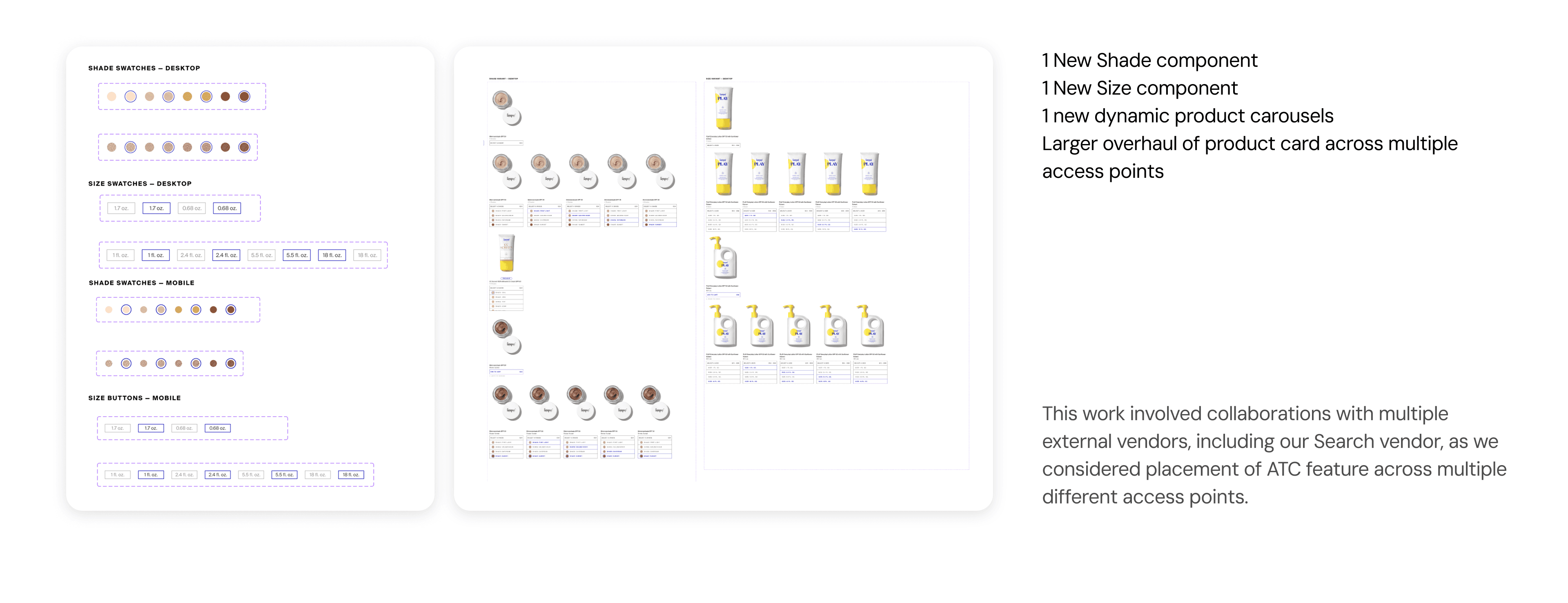
Expose shade components at highest-level (upon load)
Re-introduce concept for more accessible variant components (i.e. 44x44 px)
Design for Desktop (movement away from Mobile)
final design direction
Retrospective
This project taught me the importance of iterating upon designs, and how to be flexible as a project evolves. The set of priorities that our cross-functional team began with changed over time, especially with evidence from our user research studies — ultimately, the original constraints to this design project shifted and opened up more avenues for what we could achieve. The skill of shifting with changing objectives, and aligning with stakeholder needs is now a core part of my design process.
Though the flow of the entire project was not “textbook,” the overall process resulted in improved product card design. Collaboration and compromise helped grow the ATC project into a much larger product card overhaul.
Future Iterations
Throughout this project, one of the key aspects that determined the project timeline was alignment of cross-functional priorities. Clear communication regarding the essential usability of components was crucial, and I see ways to improve how I brought up these concerns throughout the process. Advocacy for UX is one of the skills I continue to develop as a UX/UI Designer, especially in environments where I work solo.
Additionally, there was plentiful qualitative data collected throughout this project, but I believe the data-driven design process could have been bolstered with quantitative data collected throughout our use of website analytics. In future iterations, I would like to determine a set of KPIs to be measured through web analytics to determine at each stage to better analyze the efficacy of each of the design approaches.