Overview
The Challenge
Making the donation process easier
CJ Reuse customers expressed difficulties and barriers that made the donation process more difficult: in particular, determining the eligibility of items and a delayed response rate from the organization. In turn, our team approached different ways to make the donation process more successful and simpler for both the donor and the service. We asked ourselves how might we streamline the donation process for users?
Process
What is the holistic picture of Construction Junction and its operations?
At the start of the design process, we wanted to understand more about the organization and how it operates. In addition to reviewing the information available on their website, our team interviewed a Construction Junction employee and two former customers in order to determine what their experiences with the organization were. From these interviews, we developed a stakeholder map and in turn created a holistic picture of the operation.
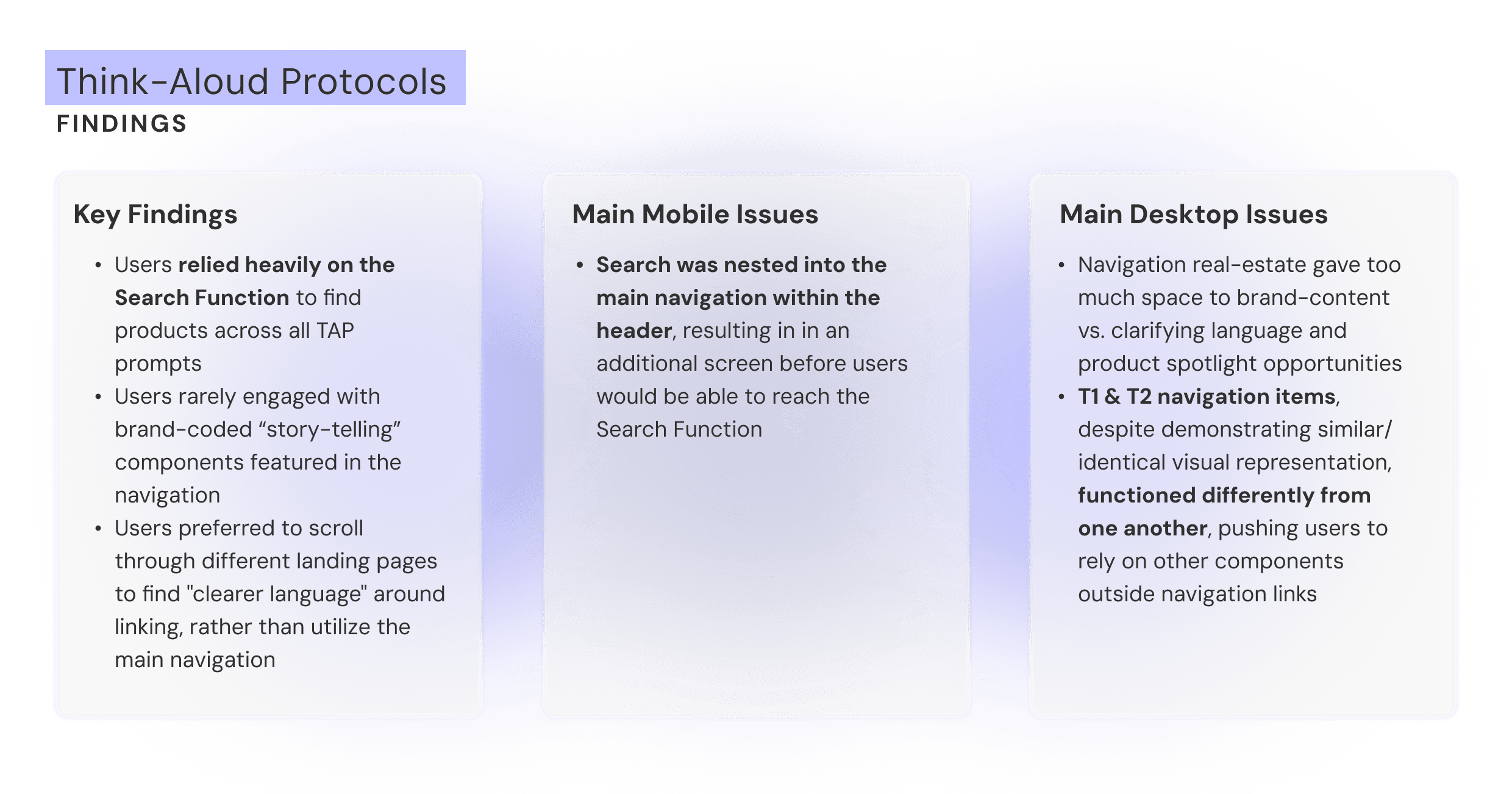
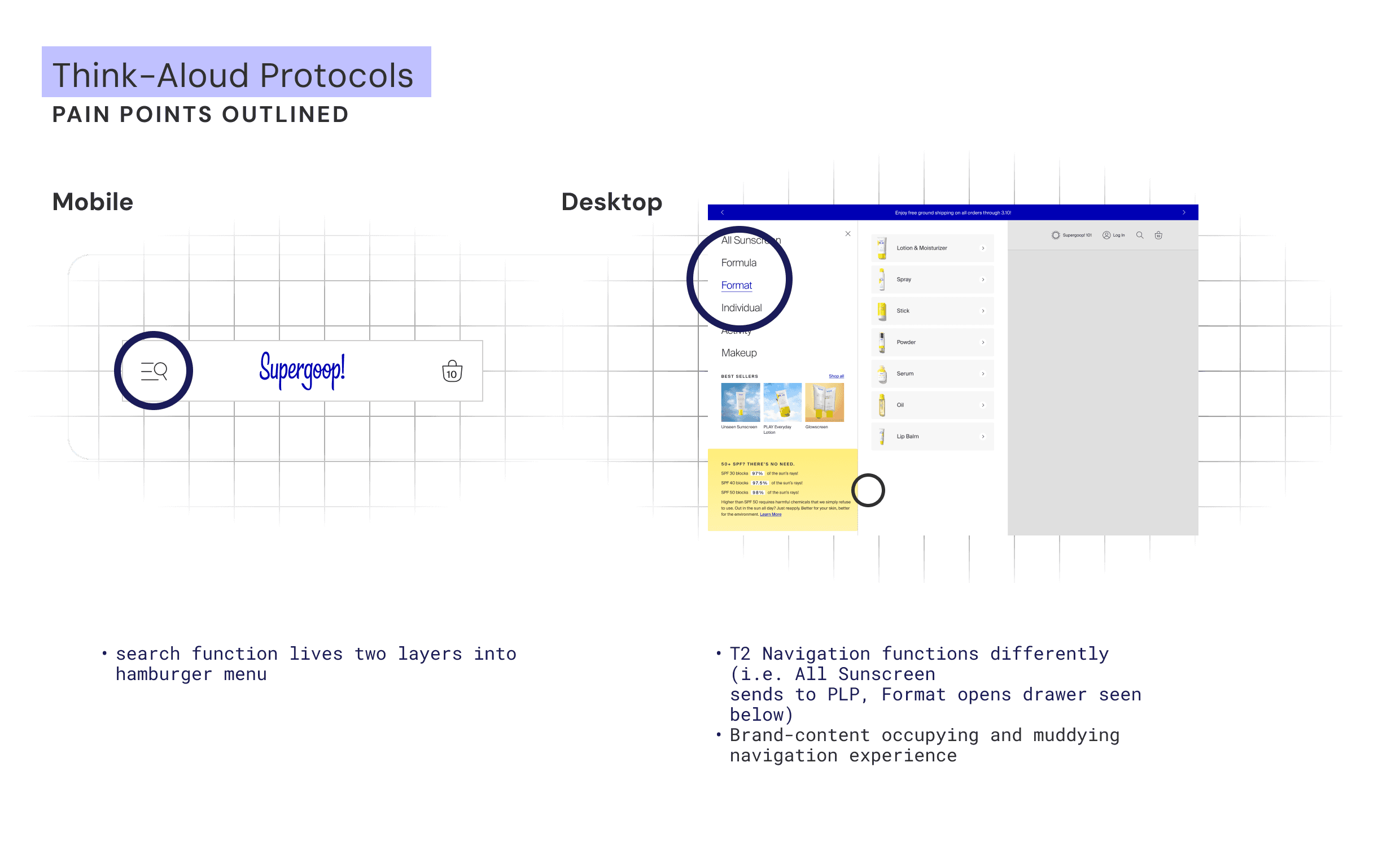
To begin tackling the issue of Supergoop!'s website navigation, our team worked with a UX agency to source users for Think-Aloud Protocols. For these tests, we prompted a range of users to navigate through our website to find specific products.
Our goals were to 1) learn what understandings users had of our merchandising catalogue and 2) determine whether our navigation system effectively aided users in their journeys. After collecting observations from these in-person interviews, our cross-functional team came together and outlined the following key findings and issues.
These findings helped inform how we would need to address the UI components and the layout of our navigation design. In particular, by being able to outline the main issues across breakpoints, I pinpointed the greatest pain points for users and created a general outline of what would need to be addressed in the prototyping phase.
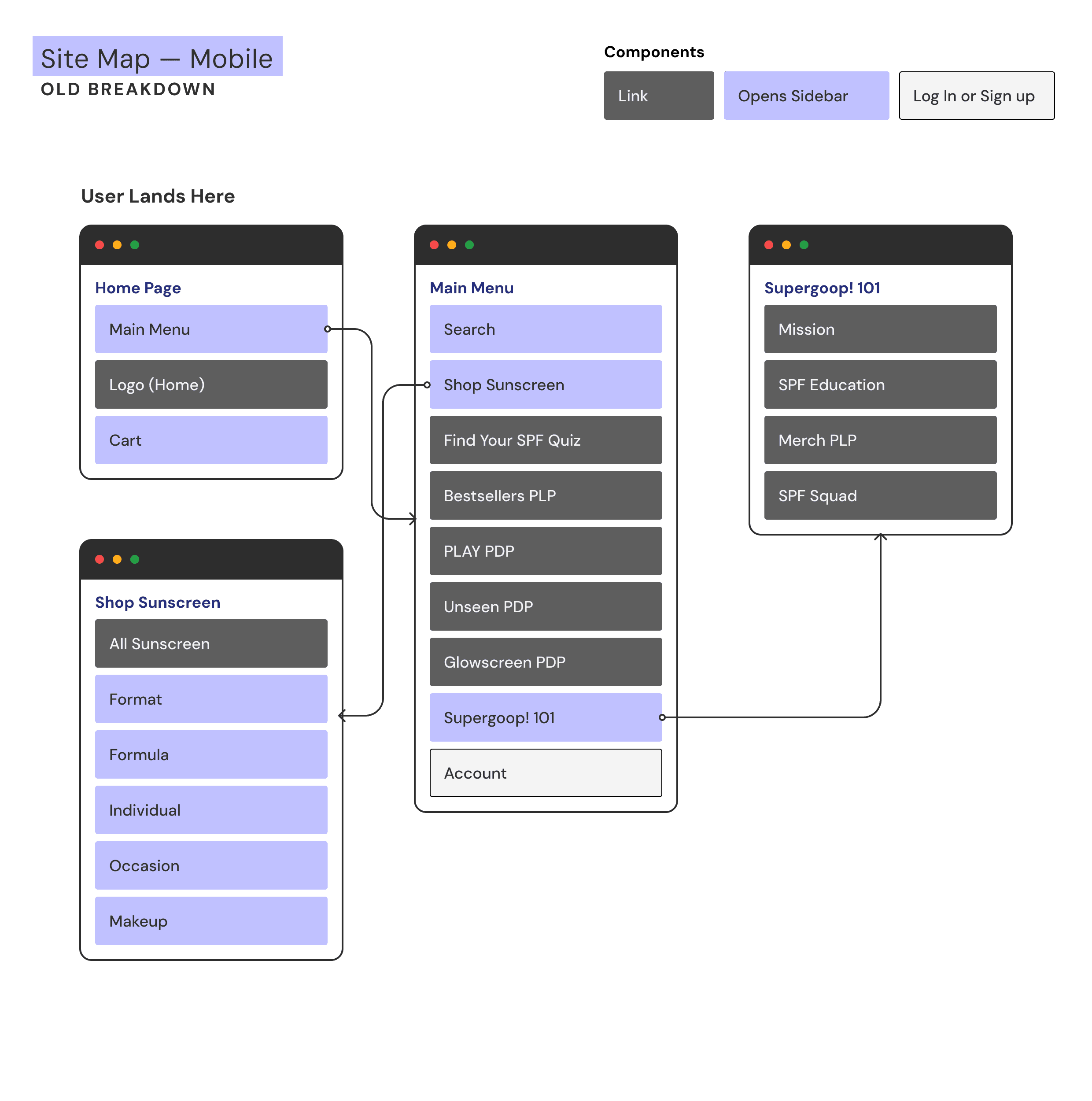
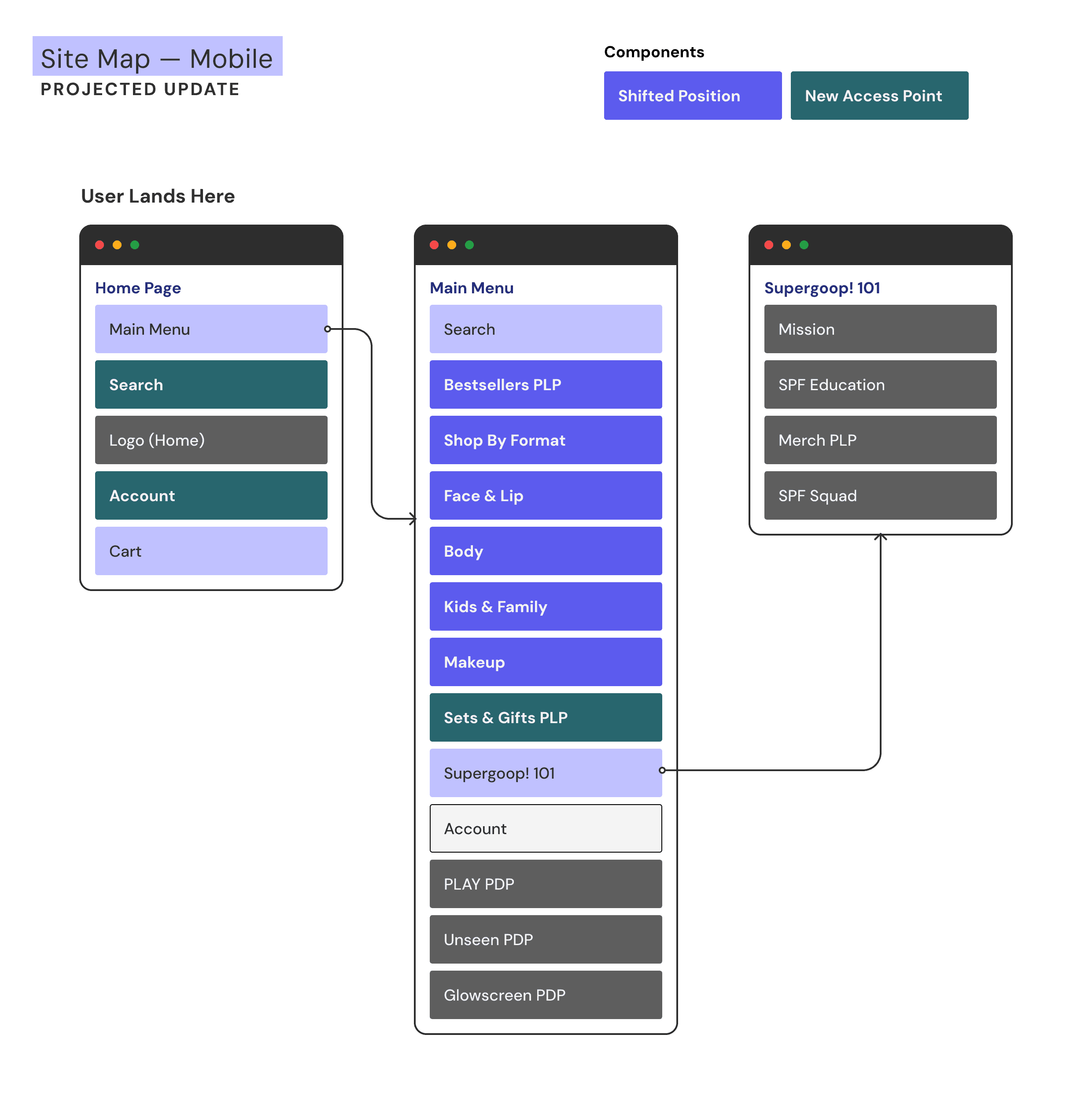
In addition to these UI updates, it became clear that part of the redesign would need to encompass what navigation items are surfaced and how we merchandise our products. This would be particularly important on Mobile, where we found that key features required additional steps in the user journey. To begin the process of reconsidering how to structure Mobile Navigation, I constructed a simplified Site Map that illustrated the issue of nesting important functions and access points too far within the navigation system. In turn, the projected solution removed the requirement of a third tier by shifting up important Navigation Categories into the Main Menu.
UI Exploration
Based on these findings, the biggest design overhaul would have to take place on Desktop breakpoints. I hypothesized that surfacing the navigation at the highest level and creating more consistency in behavior would allow users to explore and retrace their steps more easily.
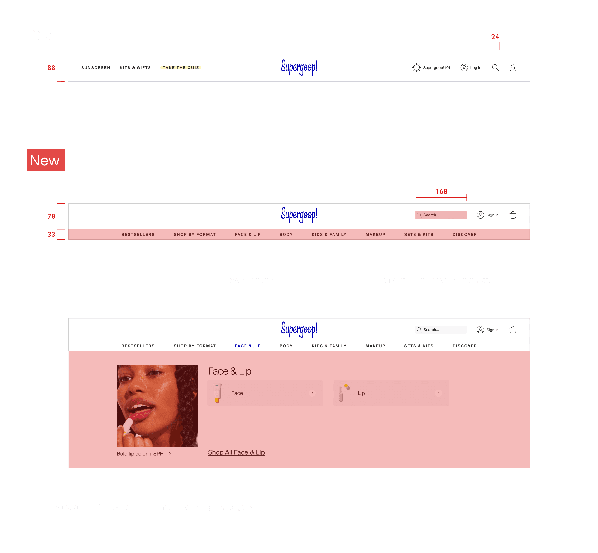
After a rapid-fire round of prototype testing, the Desktop solution replaced the sidebar navigation with a sticky navigation that simplified the number of sub-navigation categories exposed to the user, while also surfacing more visual information that would cue users' expectations for each of the highlighted merchandise categories.
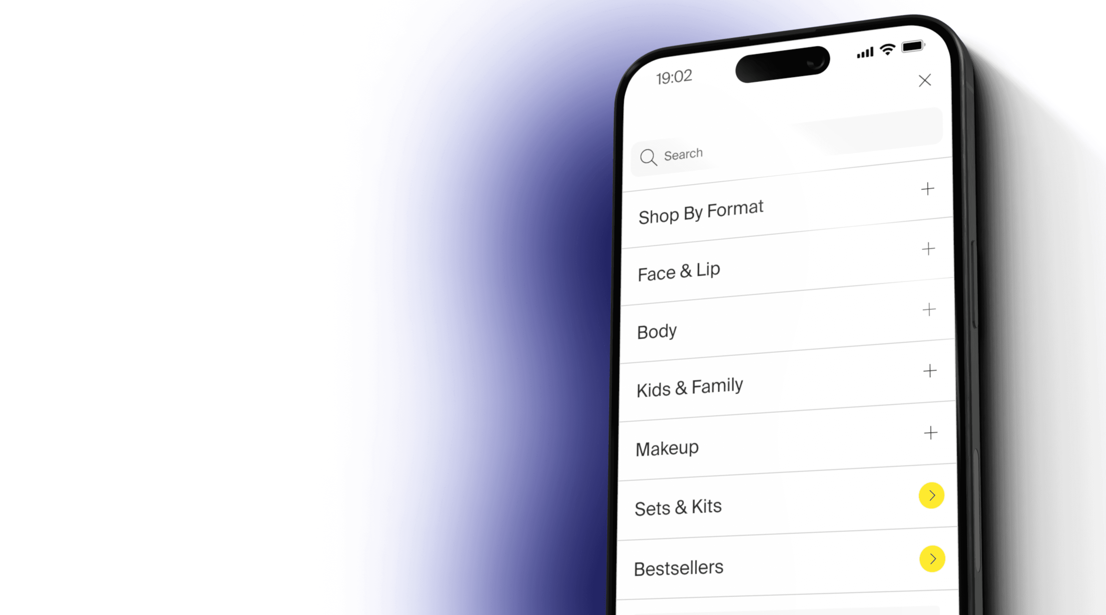
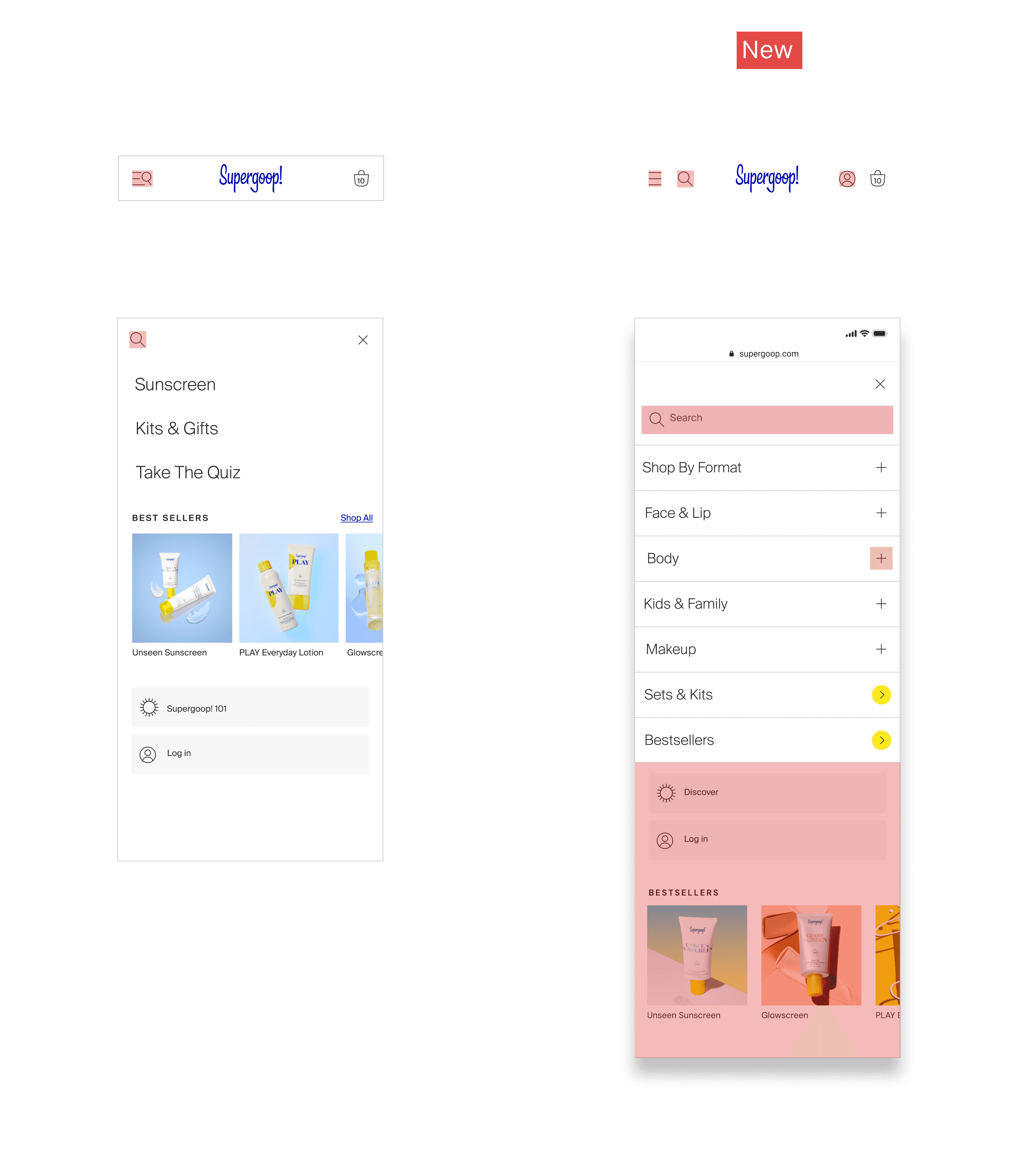
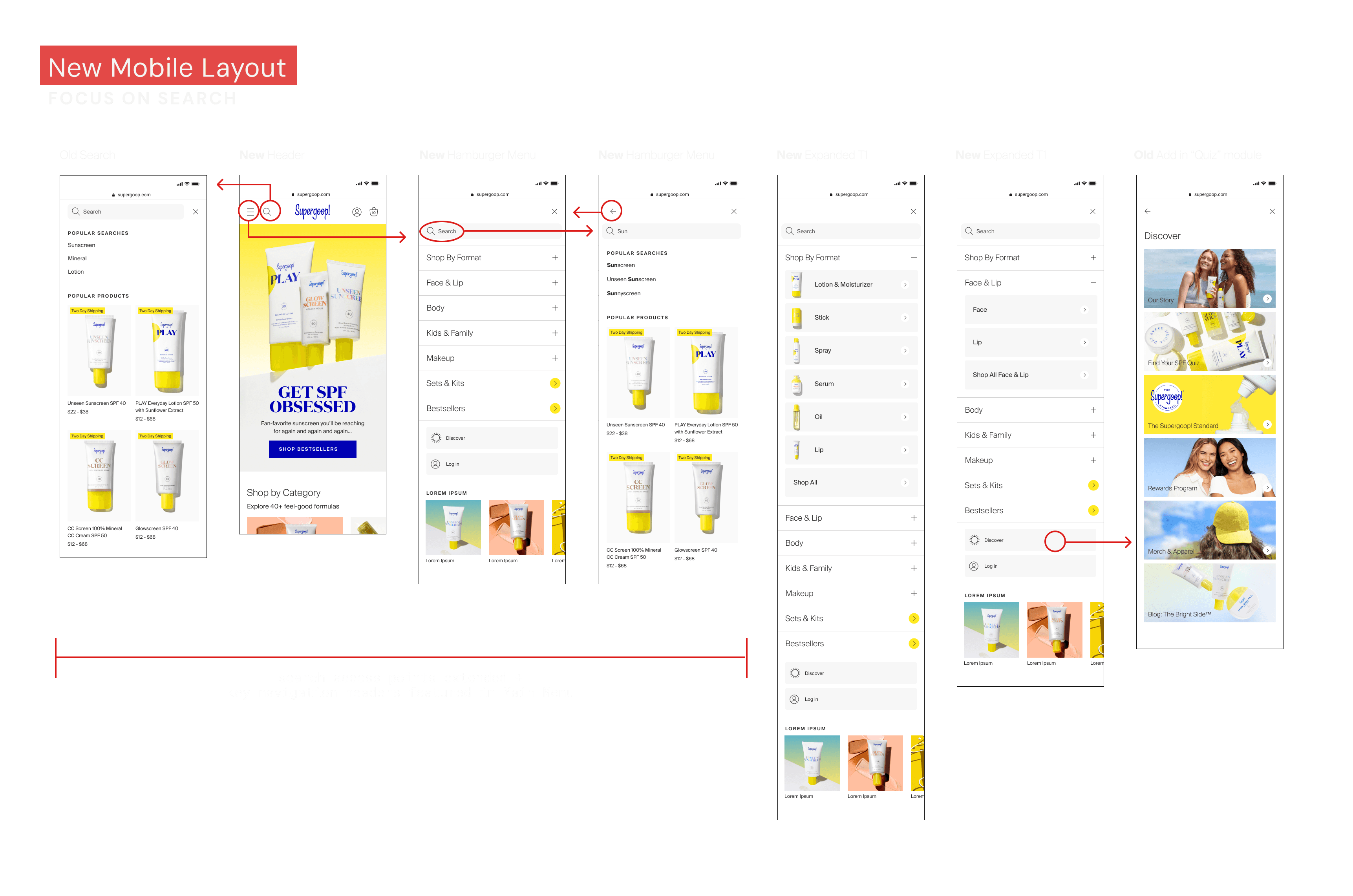
For Mobile, the main issue to address was the breaking of behavior expectations and the barriers to accessing Search. To address this, I prototyped a version of then navigation that broke out Search from the hamburger menu and included more consistent UI elements across the mobile navigation.
What I hoped to achieve in these designs was overall increased ease of use for customers. On Desktop, the new design exposed navigation with additional visual cues that better communicated expectations about what products would live under each merchandising catalogue. Similarly, on Mobile, this solution reduced the number of screens and interactions required for users to explore the product catalogue and exposed Search as a more seamless experience with increased access points.
Shipping to Production
I worked closely with our external Development team as well as our Search Function vendor to get the updated navigation on an expedited timeline for the upcoming sale. During this time, I developed a close relationship with our external partners and in working together learned more about how to communicate in a way that helped facilitate a more seamless delivery-to-production pipeline.
Desktop
Mobile
Retrospective
This project taught me how to communicate and work closely with developers during the design process. By integrating their insights early on in explorations, we were able to avoid any unexpected functionality roadblocks. In fact, we began discussions as early as the affinity mapping stage.
Outside process, this project taught me a larger lesson about design updates in practice. The global navigation redesign came at the heels of a large website overhaul. Revisiting the navigation in such a short turnaround from the overhaul launch was not a tactical approach I expected, but the results of the improved customer journey during the yearly sale indicated the positive outcome of this strategic shift.
Future Iterations
One of my remaining key concerns at the end of push-to-production was the inconsistency across menu items. While we solved the problem of simplifying our navigation system overall, the team had conflicting views on how to surface a critical PLP like Bestsellers vs. a PLP like Body that would require sub navigation.
To resolve this conflict of opinions, I would like to employ an A/B test of a navigation that prioritizes functional consistency over the one that was launched in order to determine which performed better. This kind of user testing approach was not something we had resources for at the time, and so I think revisiting the design in this manner would produce more helpful insights.